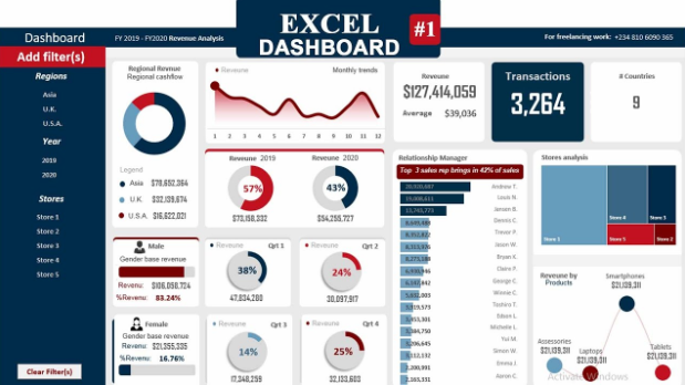
An Excel dashboard is a smart way to display data in a simple and clear format. It helps you track numbers, spot trends, and share important information in one place. People often use Excel dashboards for business reports, school projects, and even daily planning.
With an Excel dashboard, you can add charts, tables, and colors to make your data easy to read. No more boring lists of numbers! Instead, you’ll have a creative and well-organized sheet that looks professional and easy to understand.
What Is an Excel Dashboard and Why Is It Useful
An Excel dashboard is a smart tool that helps organize and display data in a visual format. It shows information through charts, tables, and summaries, making it easier to understand complex numbers. This tool is popular in business, project management, and even school assignments.
The main advantage of an Excel dashboard is its ability to show key information in one place. Instead of reading long reports or spreadsheets, users can quickly see important trends and make decisions. This saves time and improves efficiency.
Many people use Excel dashboards because they are flexible and customizable. You can add visuals and arrange them in a way that suits your needs. Whether tracking sales, expenses, or tasks, an Excel dashboard keeps everything organized.
Easy Steps to Create Your First Excel Dashboard
Creating your first Excel dashboard might sound tricky, but it’s easier than you think. Follow these simple steps to get started:
- Collect your data: Start by gathering the information you need to display.
- Clean your data: Remove duplicates and fix errors for accurate results.
- Select your visuals: Choose charts, graphs, or tables to display the data.
- Build your layout: Arrange visuals in a clear and logical way.
- Add formatting: Use colors, labels, and titles to make your dashboard readable.
Taking these steps carefully will help you create an Excel dashboard that looks great and works perfectly. Test it after creating to make sure all elements update correctly.
Best Tools and Features to Use in Excel Dashboard
Excel has powerful tools that help make dashboards better. These features allow you to create dynamic reports that update automatically.
- PivotTables: Organize and summarize large amounts of data easily.
- Slicers: Filter data quickly without complex formulas.
- Conditional Formatting: Highlight important trends by changing cell colors.
- Charts: Create line, bar, or pie charts to visualize information.
- Data Validation: Ensure users enter correct data.
These tools save time and effort when creating interactive dashboards. Learning how to use them will improve your reporting skills.
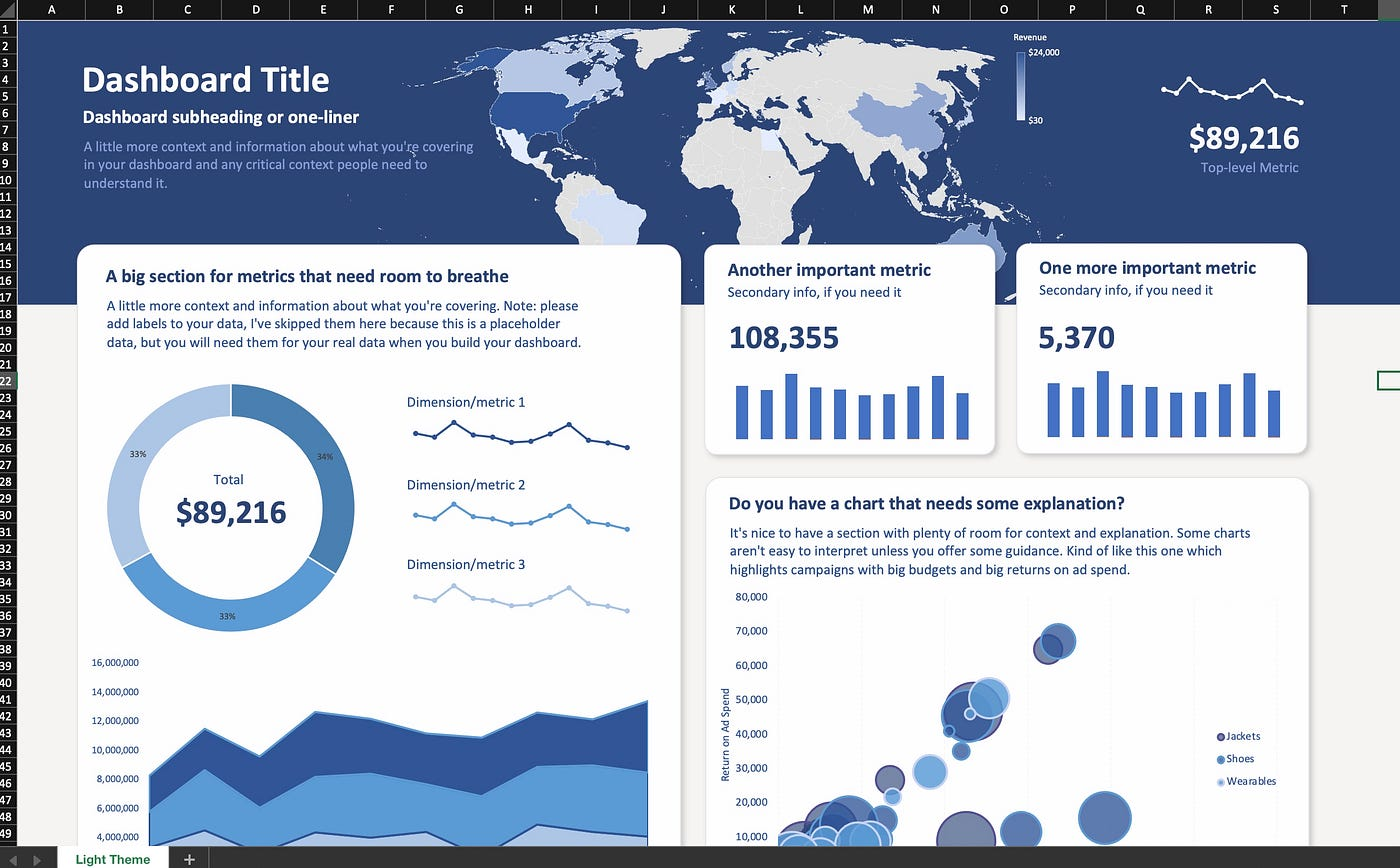
Creative Design Ideas for Professional-Looking Dashboards
A well-designed Excel dashboard looks good and is easy to use. Here are some tips to help you:
- Keep it simple: Don’t overcrowd the dashboard with too many visuals.
- Use colors wisely: Highlight key information but avoid bright, distracting colors.
- Group related data: Place similar charts and tables near each other.
- Add titles and labels: Help users understand what they’re looking at.
- Focus on user needs: Include only the information that matters most.
With these design ideas, your Excel dashboard will be both functional and visually appealing
Common Mistakes to Avoid When Making an Excel Dashboard
Creating an Excel dashboard is a learning process. Avoid these common mistakes to save time and effort:
- Too much data: Showing every detail makes your dashboard cluttered.
- Poor color choices: Bright colors can make data hard to read.
- No updates: Dashboards that don’t refresh are not helpful.
- Ignoring user needs: Build the dashboard for the audience, not yourself.
By avoiding these errors, you’ll create dashboards that are useful and easy to read.
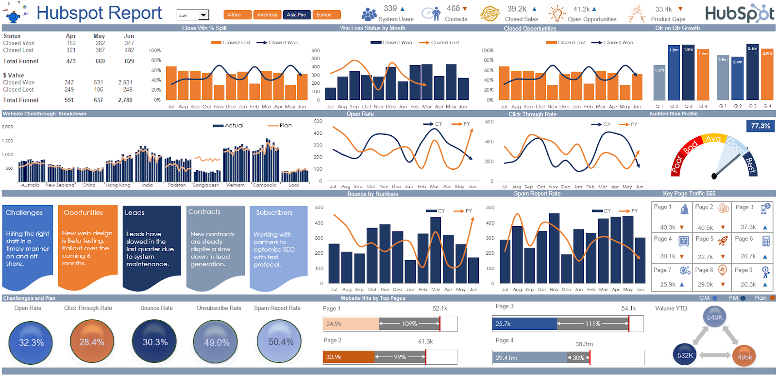
Real-Life Examples of Powerful Excel Dashboards
Excel dashboards are used across different fields to solve problems and improve decision-making. Here are a few examples:
- Sales Tracking Dashboard: Helps sales teams monitor performance.
- Project Management Dashboard: Tracks tasks, deadlines, and progress.
- Financial Dashboard: Monitors expenses, profits, and losses.
- Customer Support Dashboard: Tracks tickets and response times.
These examples show how flexible and powerful Excel dashboards can be for many tasks.
Conclusion
The Carl Bot Dashboard is a fantastic tool that makes managing your Discord server easy and fun. It helps you create custom commands, manage roles, and send automated messages. With this dashboard, you can keep your server organized and save time doing boring tasks.
Whether you run a big gaming server or a small community group, the Carl Bot Dashboard has features to fit your needs. By learning how to use it properly, you can create a friendly and well-organized space where everyone enjoys spending time.
FAQs
Q: What is the Carl Bot Dashboard?
A: It’s a tool that helps you manage your Discord server with features like roles, commands, and automated messages.
Q: How do I start using the Carl Bot Dashboard?
A: Visit the Carl Bot website, log in with your Discord account, and select your server to start using it.
Q: Can I create welcome messages with the Carl Bot Dashboard?
A: Yes, you can set up automated welcome messages for new members in the “Auto Messages” section.
Q: Is Carl Bot Dashboard suitable for beginners?
A: Yes, it’s user-friendly and easy to understand even if you’re new to Discord.
Q: Can Carl Bot Dashboard help prevent spam in my server?
A: Yes, it has moderation tools that block spam messages and unwanted content.